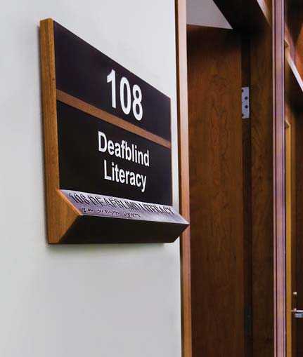
A tactile sign is any sign that can be read by touch. Braille, raised print and raised symbols or pictograms are examples of tactile elements used on signs. Doors and openings that lead to public spaces should be identified by tactile signage.

The most effective location for a tactile sign is on the wall on the latch side of a door or opening. It should be consistently placed with its centre line 1,500 mm above the floor and its closest edge 140 – 160 mm from the doorjamb. Lower mounting heights may be appropriate in facilities intended primarily for the use of children. If wall space is not available adjacent to a door latch, mount the sign on the nearest adjacent wall. A clear wall area spanning at least 75 mm should surround the sign. With double doors of any kind, signs should be placed at both sides of the doors.
Raised Print Signs
Raised print signs are useful for people with no vision at all or for people whose remaining vision is sufficient to allow them to locate a sign but not sufficient to read it.
Some people impacted by blindness, especially those born with little or no vision, may not know what print looks like and may be unable to read raised print. For this reason, all raised print signs should be accompanied by uncontracted braille.
Raised print signs should be mounted with their centre lines 1,500 mm above ground level, located in a place where they can be touched without causing an obstruction.
Characters on a raised print sign should be 0.8 – 1.5 mm higher than the surface of the sign. The edges of the characters should be gently rounded. Avoid half-rounded or stylized characters.
Characters should be in sans serif font, 16 – 50 mm in height. Pictograms and symbols should be larger. For more information, refer to the section Symbols and Pictograms.
If the sign is to be read only by touch, use all uppercase tactile characters. It’s easier to read uppercase by touch than a combination of uppercase and lowercase.
Where the tactile characters on a raised print sign are also intended to be read by sight, refer to the section Letter Size, Type Style and Distance.
Ideally, raised print signs are colour contrasted to the surrounding surface. Avoid raised borders around raised characters unless the border is at least 75 mm from the characters.
Braille Signs
Braille signage is essential for accessibility of information to individuals who exclusively use braille.
Use braille signs consistently to identify key features in the built environment. Use uncontracted braille for signs that have 10 words or less and contracted braille for signs with more than 10 words.
Raised print characters should be accompanied by uncontracted braille. Braille dots should have a dome or rounded shape for easy recognition.
Refer to these recommended ranges for braille signage:
- Braille dot base diameter: 1.5 mm
- Braille dot height: 0.6 – 0.8 mm
- Distance between any two dots in the same cell (centre-to-centre): 2.3 – 2.5 mm
- Distance between corresponding dots in adjacent cells (centre-to-centre): 6.1 – 7.6 mm
- Distance between corresponding dots from one cell to the cell directly below (centre-to-centre): 10 – 10.1 mm
Braille should be located directly below or adjacent to the corresponding print and separated from it by at least 10 mm. If the text is on multiple lines, the braille equivalent should be placed below the entire print text.
Measured from the baseline of the braille text, braille should be located a minimum of 1,015 mm and a maximum of 1,525 mm above floor level to ensure a reader never has to bend over to touch braille type. An exception to this recommendation is braille used in elevator controls, as the size of the control panel may vary depending on the number of floors.
Braille signs can be challenging to read if they are mounted vertically. Mount them ideally 5 to 10 degrees from horizontal.
Braille should be used in accordance with the Unified English Braille Code, except for the indication of uppercase letters. For more information on braille, refer to Reading and Writing.
Use an uppercase letter in braille signage only under these conditions:
- The first word of sentences
- Names and proper nouns
- Indicating individual letters of the alphabet
- Initials or acronyms
Do not use braille on railings. A person reading a braille sign on a railing becomes a temporary obstruction and a possible safety threat to themselves and to others.
A good resource for the design and installation of braille signs is the Government of Canada’s Tactile Signage: Sign System and Installation Guide.

