Follow these guidelines for stair nosings:

  • Nosings should project no more than 25 mm.
  • Where nosings project, they should be sloped to the riser at an angle greater than 60 degrees to the horizontal.
  • For rounded nosings, the radius of curvature at the leading edge of the tread should be a maximum of 13 mm.
  • Steps should be made of slip-resistant material and have nosings or inserts made of non-slip material.
  • Stair nosings should have a colour/brightness-contrasted strip across the leading edge of the tread that is 40 – 60 mm deep. The colour/brightness between the contrast strip and the surface of the tread should be at least 50 per cent. The contrast strip should extend to the front edge of the nosing. It should not extend down the front face of the nosing/riser by any more than 10 mm. On stairs, light-coloured strips used on dark treads are preferable to light-coloured treads used on dark strips. People impacted by blindness don’t easily notice dark strips on nosings. For more information, refer to the section Colour and Brightness Contrast.
A good example of universal design for stairs. Nosings incorporate good colour contrast.
An example showing poor use of stair nosings. The light-coloured treads with black strips on the nosing create a marking pattern that is not perceived well by people impacted by blindness.
An example of poor stair design – black stairs with no colour contrast on the nosing.
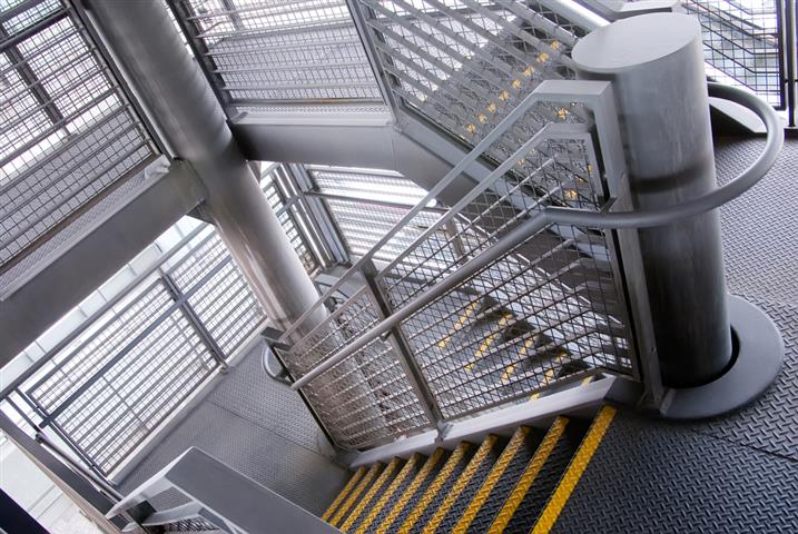
A steel staircase with colour-contrasted nosings provides an example of good stair design. The design would have been even more accessible for people impacted by blindness if colour contrast had been applied to the handrails.